Overview
Amazon, one of the world’s largest and most influential e-commerce platforms, serves millions of users daily with a vast array of products and services. Despite its success, the website's user experience (UX) and user interface (UI) have been a topic of debate, often criticized for being cluttered and challenging to navigate. This case study explores the process of redesigning Amazon's website to enhance usability, streamline the user journey, and improve the overall visual appeal.
Problem Statement
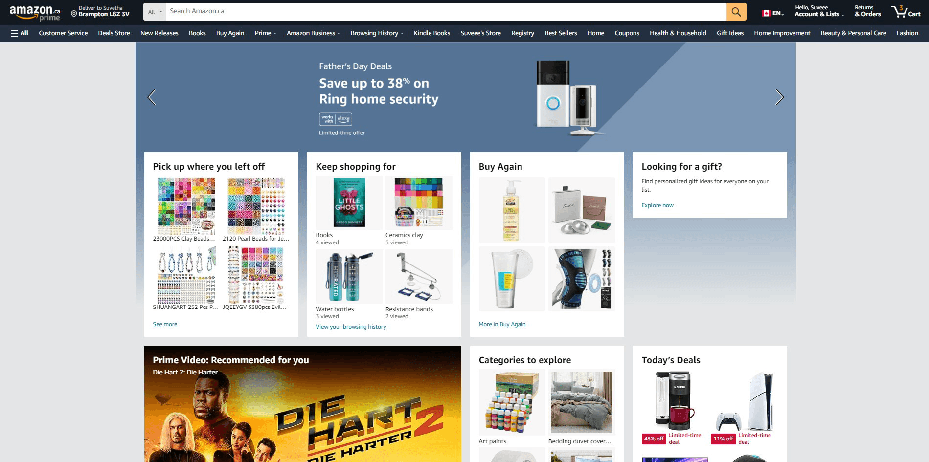
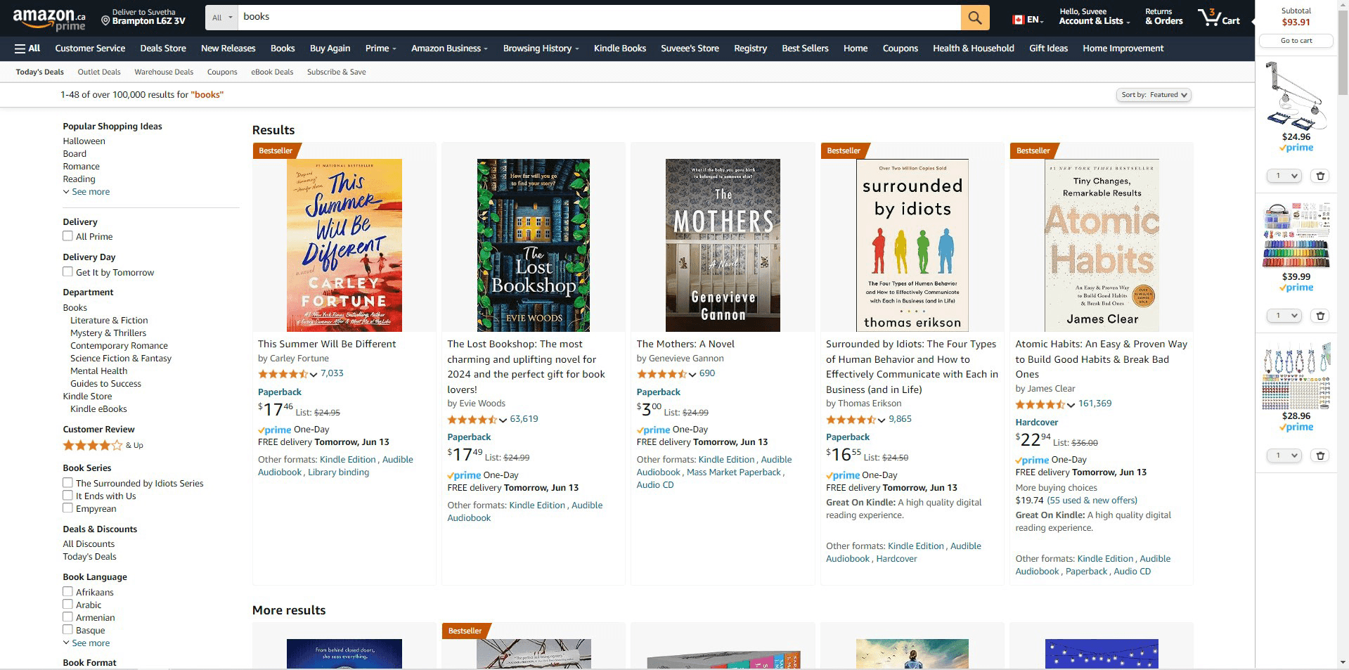
The motivation to redesign Amazon's website arises from recognizing that it does not fully meet the evolving needs of its users. Despite its resources, users face a cluttered interface, difficulties with shared carts and wishlists, less personalized recommendations, authenticity issues, and a poor browsing experience. These problems cause frustration and inefficiency, making navigation, managing shopping lists, and finding relevant products challenging. Concerns about product authenticity and browsing further diminish satisfaction. The redesign aims to create a more intuitive, efficient platform, ensuring a smooth and satisfying user experience akin to a centralized hub for seamless transactions.
Role UX UI Design Tools Figma, Figjam Timeline April - June 2024
Creative Process
01 User Research
Online Review
To gather additional user feedback, I examined reviews on platforms like Reddit, Quora, and various articles discussing Amazon users' experiences with the website. Many users frequently noted that the user interface (UI) is cluttered and disorganized, leading to a slower shopping experience.

User Interview
I have Conducted interviews for 5 Amazon users. Here are some questions I asked in interviews:
How often do you use Amazon's website?
How do you find Amazon's shopping experience?
Have you ever encountered any difficulties navigating the site? Can you describe a specific instance?
What do you like most about shopping from Amazon?
Are there any features or aspects of the website that you find frustrating or difficult to use?
How long do you spend on the site? What do you use Amazon for (shopping, browsing, ideas)?
How do you feel about Amazon's overall experience
02 Identifying Pain Points
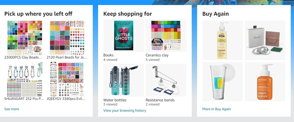
Pain Point 1 - Cluttered Interface and Browsing: The current layout is crowded, making navigation and browsing difficult, with personal recommendations often missing the mark.
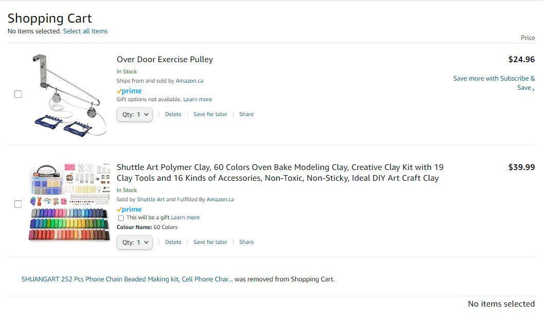
Pain Point 2 - Disorganized Shared Carts and Wishlists: Managing shared carts and wishlists with family members is confusing and inefficient.

Pain Point 3 - Inefficient Order Tracking and Updates: Tracking orders is not user-friendly, and users are not well-informed about changes to wishlists or price updates.

Pain Point 4 - Unclear Product Authenticity: It's challenging to distinguish between official products and duplicates, raising concerns about authenticity.
03 Persona
Utilizing insights and details from the interviews and research, I developed a persona to steer my design process with empathy and prioritize the users' needs.

04 Ideation
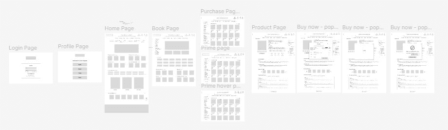
User Flow
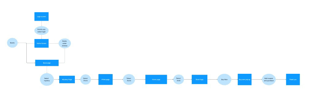
Wireframes
I designed each step of the wireframes. As I laid them out in Figma, I identified weaknesses in my initial ideas. By maintaining a narrow scope and iterating on these wireframes, I was able to develop new solutions.
05 User Testing
To ensure my app met the needs of my target users, I created a prototype in Figma and tested it with five participants. I established several test goals to guide the testing process.
Goal 1 - Determine whether users can navigate the app effortlessly and locate key features without confusion.
Goal 2 - Evaluate whether users find the app's design visually appealing and intuitive
Goal 3 - Verify that all primary features work as intended and meet user expectations.
Goal 4 - Assess how efficiently users can complete specific tasks within the app, such as signing up, searching for information, or making a purchase.
Goal 5 - Gather qualitative feedback on the overall user experience, identifying any pain points or areas for improvments
Goal 1 - Ease Of Navigation
Goal 2 - User Interface Satisfaction
4/5 users navigated through the app effortlessly
5/5 users found the website design
visually appealing and intuitive
Goal 3 - Feature Functionality
Goal 4 - Task Completion
Goal 5 - Feedback
1/5 users had difficulty locating prime selection
5/5 skipped through the apply coupon part
5/5 users were able to complete the task
5/5 users enjoyed using the sit and loved the redesign
2/5 suggested some feedbacks and are of improvement
Key Takeaway
1
Users wanted more clickable options, believing that additional interactive elements would allow them to explore the site more thoroughly and gain a better understanding of the redesign.
2
3
Wanted more information about the product summary before proceeding with the purchase, specifically wanting a detailed overview, such as a summary of the book.
Suggested different options they preferred to see in the four personalized recommendations.
Resulting Revisions

Before
After
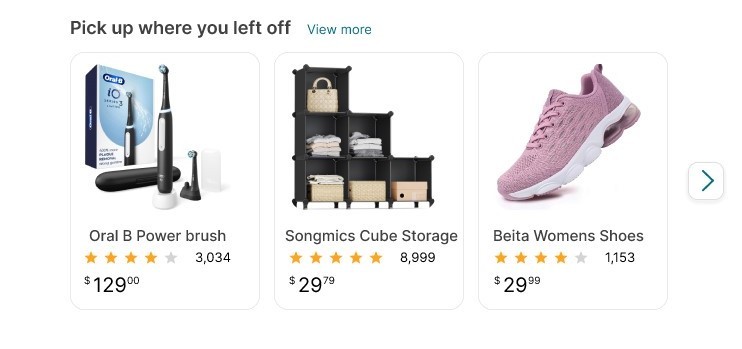
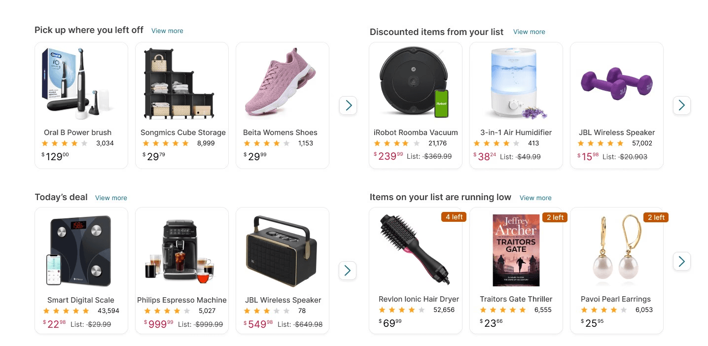
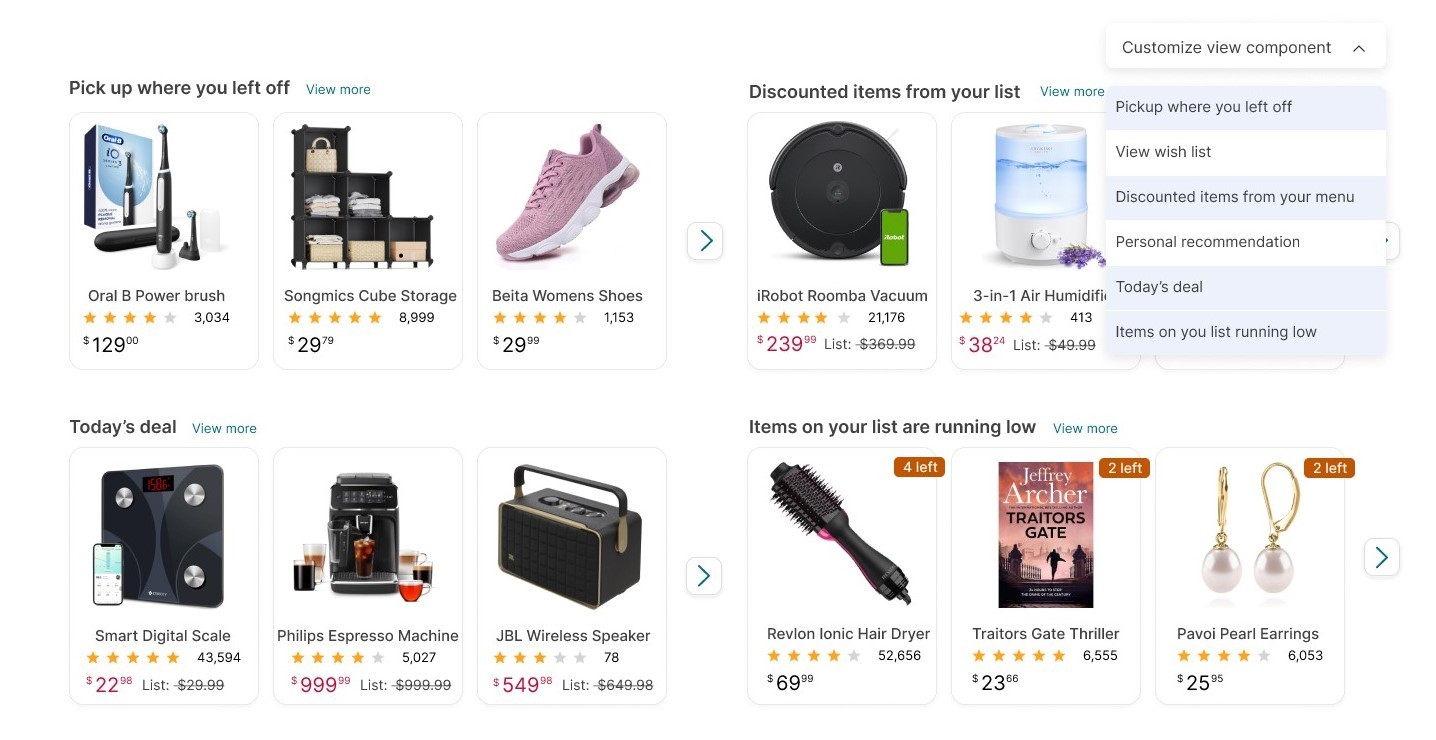
Users suggested various options for the four personalized categories. Instead of adding more categories, I added a customizable view component with a dropdown box, allowing users to select what they want to see in each of the four categories.
Made each preview image clickable
Before
After
Users suggested various options for the four personalized categories. Instead of adding more categories, I added a customizable view component with a dropdown box, allowing users to select what they want to see in each of the four categories.
Before
After
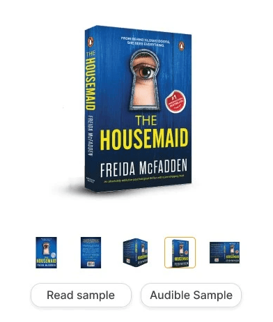
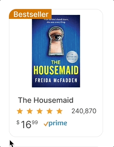
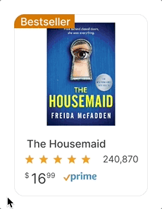
Users felt it would be helpful to learn more about the book in the preview, such as reading the summary. To address this, I implemented a flip card feature that reveals the book summary, mimicking the experience of turning the book over to view the back cover.
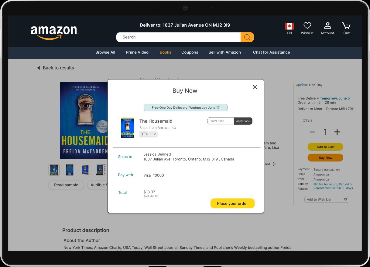
06 Final Design
Key Features
At the top of the homepage, I added a section for tracking orders and returns. This allows users to quickly check the status of their orders and returns without navigating further into the site, as many users log in to Amazon specifically for this purpose.
I added a chat for assistance in the menu bar to make it easier for users to get help on Amazon, as many found it difficult to do so before.
Since Amazon pages are long and filled with many products, I added a "scroll to top" button to make it easier for customers to return to the top of the page quickly.
I added a hover-over effect to reduce the amount of information displayed on the page, as many users found it too messy. When users hover over a product, more details appear along with options to add or remove the item from the cart, eliminating the need to go to the cart page. This feature is optional to accommodate users who prefer seeing all the information and those who do not.
I implemented a search function for filters to make it easier for users to find what they need. Instead of scrolling through numerous filters on Amazon, users can now simply search for the specific filter they want.
I've introduced an authenticity option to address user concerns about duplicates and fake products. This feature relies on Amazon's filtering of products and reviews to ensure authenticity.
Amazon is often shared among family members, which can mix up personal preferences, wishlists, and carts. To make this less frustrating and messy, I created an Amazon Household option inspired by the concept of a family plan. In this design, I incorporated profiles for each family member. This allows each user to have their own personalized recommendations, carts, and wishlists.
I added a section to quickly apply coupons without needing to go to the cart. This makes it more convenient for users to use their discounts while shopping.